-
the Layout introduction
In early 2010 my wife and I decided to construct a new home - the home of our dreams – if you will. It was extremely exciting and sometimes stressful designing and custom building a new home from scratch, however, a home that is designed for aging in place, and; a BIGGER layout room was the result! So, with the assistance of my existing ops crew, the design of a completely new layout to be constructed in the 1200sq ft layout room was undertaken. After considerable thought and reflection, I stayed with the same prototype, locale and almost the same era because there are so many positive attributes for this prototype and era which include:
- dramatic natural scenery
- pusher operations due to the restrictive 2.2% grades
- dramatic bridges – there were numerous major spans
- modelable and modest sized trains
- FM Locomotives
- lake barge operations that ran into the 70’s & 80’s
- diverse and large scale industries
- interchange and feeder routes with the GN
- time table & train order operation
-
As with any layout, lessons can always be learned from experience, and following are some thoughts and observations about the old layout learnings and how they were considered in the new layout designs and concepts. I am by no means an “expert”, however, this layout is my fourth, so I am sure there is some useful experience in there somewhere! We broke the planning strategy into two areas of attention; Macro Issues which dealt with high level items, and Layout Specifics which dealt with the more detailed aspects of design and priorities. These areas are not independent, but rather they are interconnected, therefore we dealt with both simultaneously as the design progressed.
-
Macro issues
Starting with a “blank page” so to speak can be both daunting and exciting at the same time. From the outset, we established some fundamental key priorities for the layout; operations based long mainline, lots of switching, and substantially prototype focussed. We wanted a layout where operators could not see the entire layout or all the other crew members any more than necessary.
Of course like all layout planning, we had to deal with the trade-off between layout footprint and aisle space, so a lot of the preliminary plans were nothing more than layout shapes with notional track alignments and major yard locations. As a result, much of the layout is on a relatively narrow shelf – generally varying from 10” to 14” in width. This is a very pragmatic approach that acknowledges that the space planning in the room is critical to a successful design and enjoyable layout to operate, and view. The aesthetics and architecture of the layout and the room were also items we felt deserved appropriate attention.
There are 2 steel columns in the train room supporting the house, and in order to fix their locations for the contractor, we had to advance the basic design and shape of the layout far enough over a year before we actually moved into the house. The height of the room also needed to be finalized before the excavation was completed for the house. We also needed to establish locations for things like; the lighting, electrical outlets, sub-panels, interior divider walls & room entry doors as the construction on the house proceeded – again well ahead of when we actually moved into the house. Most decisions turned out just fine and we were able to adapt to anything that ended up being a little off.
To the right is a PDF outlining in detail most of the key issues we dealt with and our own perspective on each of them. Naturally, other layout owners may have a different approach to some of these items than we have, so we offer them as food for thought, and not as a list of the proper way to do things.
-
layout specifics
Because we wanted a long mainline, one of the biggest decisions was whether it could be accommodated on a single level layout, or a multi deck layout would be required. So we did some pre-planning in what I believe is a somewhat unique approach.
I researched a significant number of large layouts that currently existed. This involved research on the web, reading articles in all the magazines, and actual visits to them during events that I attend. Using a very unscientific approach, I basically developed a summary of key facts for these layouts that included; room size, mainline length, single or multi deck, mushroom or not, aisle widths, and what I would call the general “type” of railroad being portrayed; e.g.; branch line, heavy mainline, etc.
Armed with this really high level data, I applied it to my own layout desires on a comparative basis to determine whether I could achieve what I wanted, and how.
It was immediately obvious, that my preference for a long mainline required a multi deck design. It also demonstrated the need for a narrow shelf type design along the mainline portions of the layout.
At the same time, we also developed this story board schematic which captured aspects of the prototype that we hoped to include in the final design. As you can see it is very rough, however, it works and remains on one of the train room walls as we continue to plan and construct the layout. So far, we have succeeded in capturing virtually everything on this concept. Click the image below to enlarge it. -
To the right is a PDF outlining in detail most of the key issues we dealt with and our own perspective on each of them. Naturally, other layout owners may have a different approach to some of these items than we have, so offer them as food for thought, and not as a list of the proper way to do things.
-
going forward
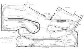
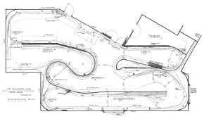
The plans which are included in this web site were developed before the house was even completed and have already gone through numerous amendments and improvements. Because of the size of the layout, we opted to produce an overall plan with the basics generally worked out, but avoided detailing most areas on the layout. We knew from experience that things change due to new information coming to light, feedback from the crew, or changes in technology. Some of the revisions to date include:
- Reconfiguring Proctor/east staging yard to increase the number and length of tracks.
- Reconfiguring Midway/west staging yard to increase the number and length of tracks. This item remains under review since it will be a while before that section of the layout is built.
- Making the mainline from Proctor to Nelson level for ease of construction. The old plan had some modest grades in there, but they didn’t seem worth the effort.
- Part of the Troup junction track layout was torn out and reconfigured after it was initially installed to be closer to the prototype.
- Continually adjusting some of the siding lengths to accommodate the proposed train lengths.
- Revising the area around BullDog tunnel as a result of the potential changes to Midway yard above it.
- Adjust distances between sidings to create some balance.
- Some adjustments of benchwork geometry to address potential aisle concerns.
- Reconfigured the room entry gate on the lower level to “nest” into a recess in the side of the benchwork at the end of the Nelson yard.
- Rework interchange tracks design at Eholt between the main and the branch to make them more accessible.
- Reducing the depth of some of the upper deck shelves from 12” to 10” to set them back from the lower deck and effectively increase the aisle width at shoulder height.
- Increasing the length of the industrial complex just west of Castlegar to afford more space for this large prototype facility.
- Eliminate the wye on the branchline at Eholt. It adds complexity and is not really prototypical.
-
And above all, my biggest recommendation is to always welcome and encourage POSITIVE CONSTRUCTIVE feedback. My previous layout benefited immensely from the feedback and ideas of my crew and guests that all made the layout better aesthetically and operationally. The concepts for this current layout are being developed with the input of many of my key regular operators.


